Investment Account Opening
I led the UX/UI redesign of iA Insurance's investment account opening experience, transforming a complex, form-heavy workflow into a clearer, more adaptive and scalable digital experience.
The challenge
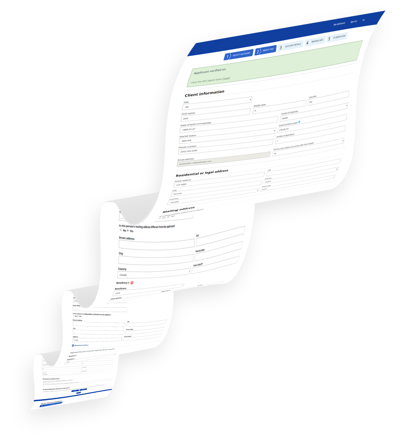
The existing investment account opening process had evolved into a highly detailed and complex workflow. Users were required to navigate long pages, repetitive questions and account-specific information that was not always relevant to their situation.
The challenge was therefore bigger than a visual redesign. The underlying experience and workflow needed to be reconsidered.
My objective was to simplify the journey while maintaining the business requirements behind account opening, creating a more flexible experience that could support different account types and user goals.
My role
Although my formal role was UX/UI Designer, I operated beyond the traditional design scope. I took ownership of the experience and helped coordinate the work required to move the redesign from an initial problem definition toward an implementation-ready solution.
I worked across UX strategy, information architecture, interaction design, visual design, prototyping and project coordination.
Experience strategy
Reviewed the existing journey, identified major usability and process issues, mapped account scenarios and established priorities for the redesign.
UX & interaction design
Restructured information architecture, simplified complex forms, introduced progressive disclosure and designed adaptive flows based on account type and user responses.
UI & prototyping
Created the visual direction, high-fidelity screens and interactive prototypes to communicate the proposed experience and validate the interaction model.
Project coordination
Broke the redesign into manageable areas, coordinated design activities, aligned stakeholders around the proposed experience and worked through implementation considerations with the development team.
Approach
I approached the project as an end-to-end service and workflow redesign rather than simply refreshing the existing screens.
The work focused on three connected perspectives: user needs, business requirements and technical feasibility.
The goal was to create an experience that was easier for users to understand, flexible enough to accommodate different investment account scenarios and practical for the organization to implement.
Screen #1
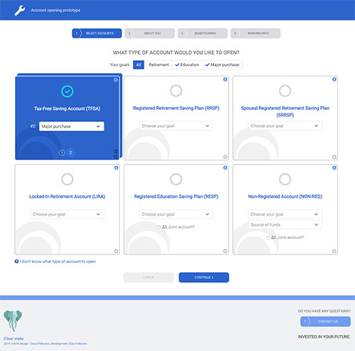
From a linear form to an account-driven experience.
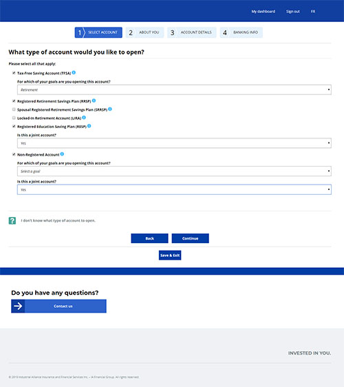
The original experience provided users with a relatively rigid sequence of questions. I redesigned the beginning of the journey around the user's goals and account selection.
The new structure allows the experience to adapt based on the selected account and creates a more scalable foundation for supporting multiple account types.
Before
After
Screen #2
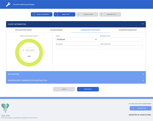
Reducing information density.
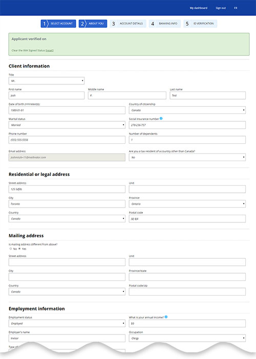
The original screen combined several types of information and required users to work through a large number of fields.
I reorganized the content into clearer sections and introduced a more structured interaction model. This reduced cognitive load while making required information easier to scan and complete.
Before
After
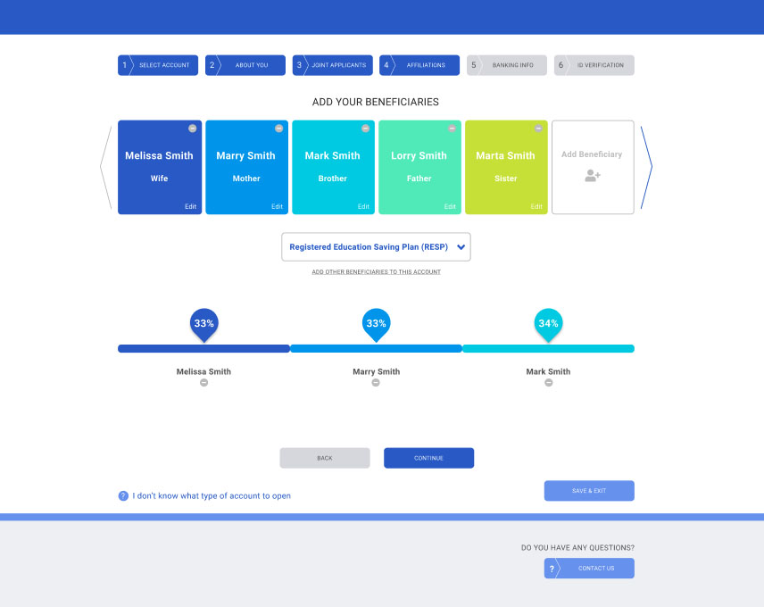
Screen #3
Making complex decisions easier to understand.
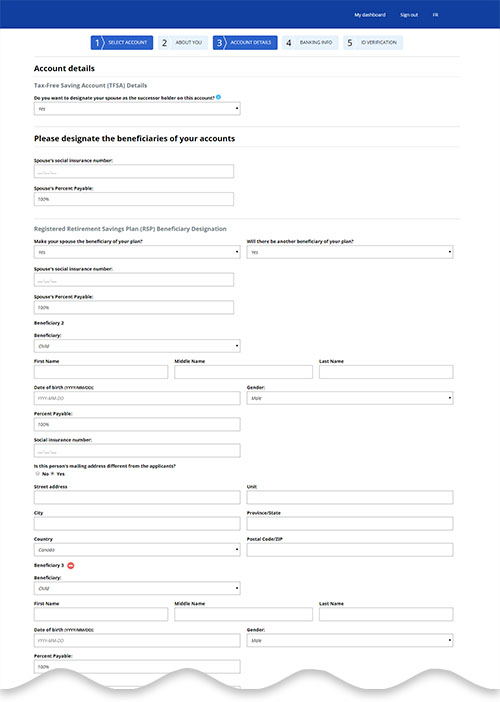
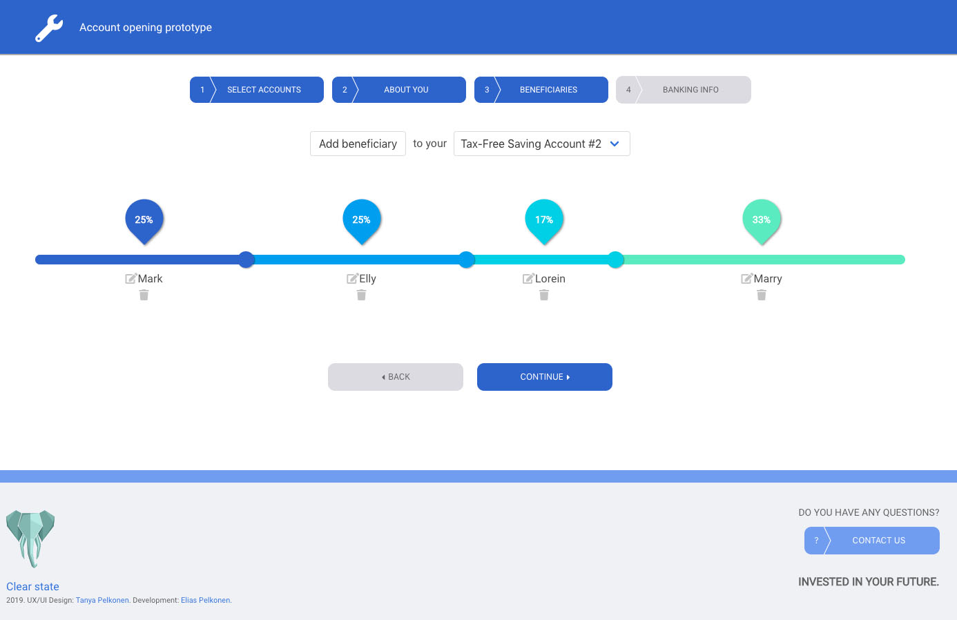
Adding beneficiaries and distributing percentages introduced additional complexity into the account-opening process. The original interaction relied heavily on traditional form fields.
I simplified the underlying interaction and introduced a clearer visual structure, reducing the number of fields users needed to manage at once.
Before
After
Screen #4
Show only what is relevant.
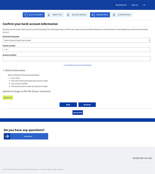
One of the major opportunities was to reduce unnecessary information based on the account selected and the answers provided earlier in the journey.
The redesigned flow progressively presents relevant questions and information instead of requiring users to navigate through every possible scenario.
Before
After
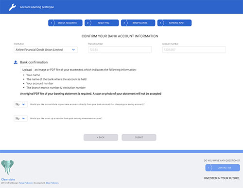
Process
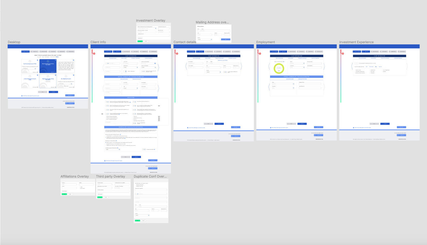
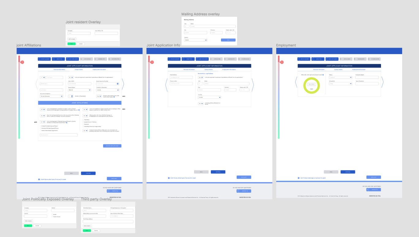
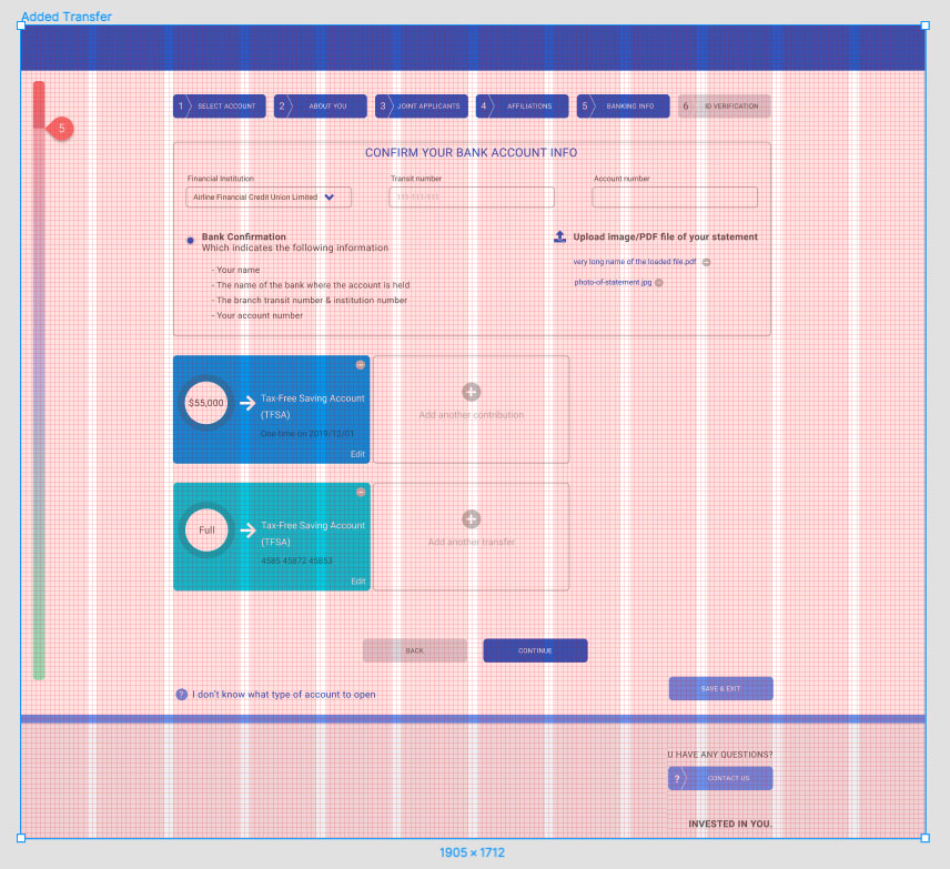
I approached the redesign as an end-to-end experience and workflow problem, not simply a UI exercise. By combining UX strategy, interaction design, visual design and project coordination, I helped transform a complex account-opening process into a clearer, more adaptive and scalable digital experience.
Throughout the project, I worked across design, business and development considerations, using journey mapping, wireframes, prototypes and high-fidelity designs to align the team around the proposed experience and move the work toward implementation.
The prototype was developed in React by a software developer: ao.tanyapelkonen.com
Outcome
The redesign established a more structured approach to investment account opening, replacing a predominantly form-driven experience with a more adaptive and guided workflow.
The resulting experience simplified complex account-opening journeys, reduced unnecessary information and interactions, and created clearer pathways based on the user's selected account and goals.
It also created a more scalable foundation for future account types and provided a clearer direction for development and implementation.
Most importantly, the project shifted the focus from redesigning individual screens to rethinking how the account-opening experience should work as a whole.